A feed where every post looks like it was made by a different person is a feed nobody trusts yet. The businesses whose Instagram actually looks like a business — not a scrapbook — are almost always working from a small set of reusable templates, not designing every single post completely from scratch.
That’s the approach behind our social media post design service. Rather than one-off graphics with no visual thread connecting them, we build a template system first — a consistent grid structure, a defined color palette, a couple of layout variations for quotes, product shots, and announcements — so a bakery posting a new pastry photo on Tuesday and a customer testimonial on Thursday both still look like they belong to the same brand.
Designing the graphics and actually running the account day to day are two different jobs, even though they often get lumped together. This service covers the visual design work — templates, individual post graphics, carousel layouts. Scheduling posts, writing captions, and replying to comments is social media handling instead. A lot of clients use both together, but they’re scoped and priced as separate pieces of work.
An image that looks perfect on Instagram often gets awkwardly cropped when the exact same file gets reused on LinkedIn, because the platforms don’t share identical aspect ratios.
We build each template to match its actual destination — square or 4:5 for Instagram feed, 9:16 for Stories and Reels covers, and a wider format for LinkedIn, which crops differently than Meta’s platforms do.

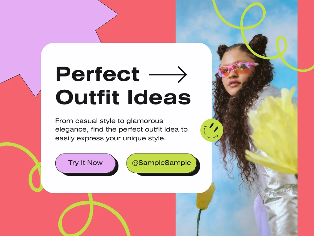
Designing one post at a time, the day before it’s due, is how feeds end up inconsistent — a rushed template edit looks different from the one made carefully three weeks earlier. Once a template system exists, we recommend batching a month of posts in a single design session, working off a content calendar rather than reacting day to day. It’s faster per post, and it’s the reason a well-run brand’s feed looks like one continuous decision instead of forty separate ones.
Both Instagram and LinkedIn crop and compress images differently depending on where they render — a feed thumbnail, an expanded post view, a shared story repost. Text placed too close to the edge of a template regularly gets clipped in one of these views even though it looked fine in the original file. We build in safe margins around any text or logo placement specifically so it survives whatever cropping the platform applies on its end, which we don’t control.
“ I love the social media posts designed by WebSnarks. They created exactly what I wanted and the process was super easy. Highly recommended! ”
“ The social media post designs created by WebSnarks perfectly express the voice of my brand. It's amazing how well they were able to convey the main points of my message. Great Work! ”
“ Throughout the design process WebSnarks provided outstanding support. Every step of the way, they made sure I was happy and involved, and delivery was on time. ”
“ My social media engagements are boosted by the posts created by WebSnarks. I was surprised by the level of support I got and the high quality of the designs. ”
A grid where every single post uses the exact same layout starts to feel less like a brand and more like a spreadsheet. The templates we build usually include two or three layout variations — a text-forward version, an image-forward version, a quote-style version — that share the same colors and fonts but don’t repeat the identical structure post after post. That variation is what keeps a feed feeling curated instead of automated.
It depends on your posting cadence — a business posting four times a week needs a different volume of design work than one posting daily. Share your planned schedule and we'll scope accordingly.
Square (1080x1080) and portrait (1080x1350, a 4:5 ratio) both perform well in-feed; portrait tends to take up more screen space while scrolling, which is why a lot of brands default to it now.
Yes — send your current logo and any brand guide you already have, and templates get built to match rather than introducing a new, unrelated visual style.
Yes — WebSnarks works exclusively with businesses in the United States, which means templates get built around how American audiences actually scroll and engage, not a generic style pulled from a global template pack.