Stock icon sets are free for a reason — they’re everywhere. The same line-style checkmark, the same generic gear icon, shows up on thousands of unrelated websites, which means it does nothing to make your site feel like it belongs specifically to you. A custom icon set, built to match your actual visual style, is a small detail that quietly signals a business paid attention to the whole experience, not just the big stuff.
Our custom icon design service builds a small, cohesive set rather than one icon at a time pulled from different sources. Consistency is the whole point — matching stroke width, matching corner radius, matching color treatment across every icon in the set, so a shipping icon and a support icon on the same page look like they were drawn by the same hand, because they were.
Stock libraries like Font Awesome or Flaticon are fine for internal tools or fast prototypes where visual identity doesn’t matter much. For a public-facing website or app, custom icons close the gap between “looks like a template” and “looks like a real, considered brand” — especially once you notice how many competitor sites are using the exact same free icon set you were about to use.
A logo identifies the business as a whole — it’s the mark people learn to recognize. Icons are functional, smaller-scale visual shorthand used throughout a site or app to represent specific features or actions.
They should share a visual language with your logo — similar line weight, similar level of detail — without literally being shrunk-down versions of it, since a logo simplified badly into an icon often loses the detail that made it recognizable in the first place.
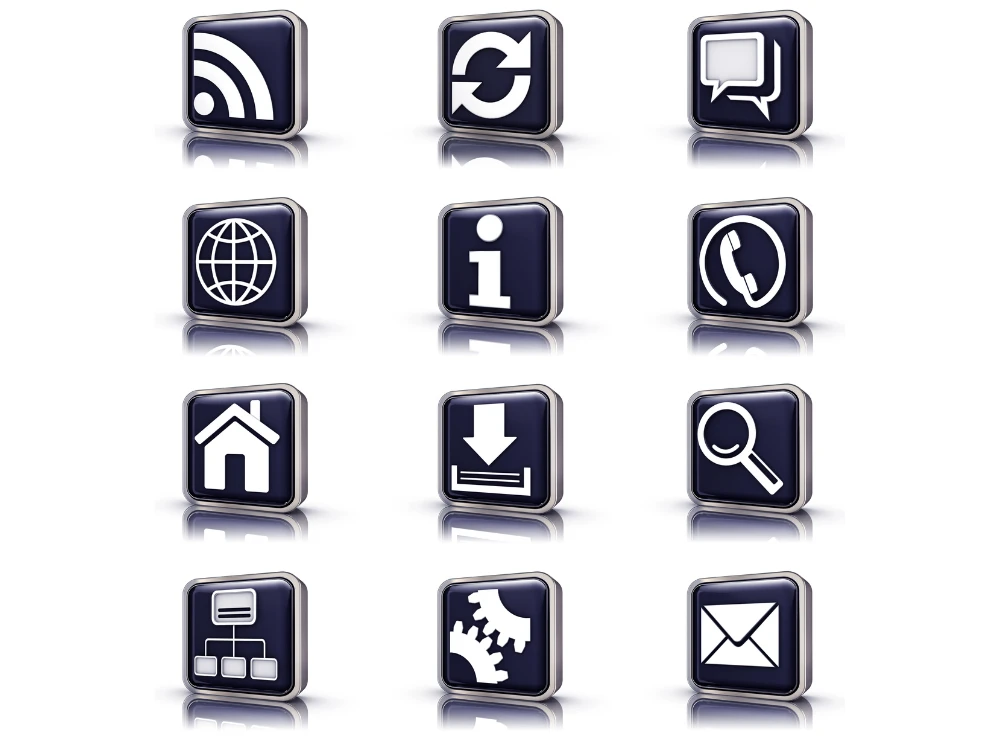

Line icons, filled icons, and duotone icons each carry a different feel — line icons read as lighter and more modern, filled icons feel bolder and more grounded, duotone sits somewhere in between with a bit more visual interest. The mistake we see most in self-made icon sets isn’t picking the “wrong” style, it’s mixing two or three styles across the same page without realizing it, which reads as inconsistent even when each individual icon looks fine on its own. We lock one style early and build the entire set against it.
An icon set designed for exactly six current features becomes a problem the moment a seventh feature launches and nobody who built the original files is available to match the style. We deliver icon sets with the underlying grid, stroke width, and construction logic documented, so a design agency or an in-house designer years from now can add a matching icon seven without having to reverse-engineer how the original set was built.
“ It is my third project with WebSnarks. They always delivery exactly what I want and understands all of my needs. Great work. ”
“ I'm amazed by the beautiful icon designs by WebSnarks. From quality to delivery they are totally different and unique from others. Appreciate! ”
“ The icons from WebSnarks truly amaze. They added alot of creativity to my work and the quality shines through every pixel. ”
“ I love the Icons designed by WebSnarks. They created exactly what I wanted and the process was super easy. Highly recommended! ”
An icon that looks crisp and detailed at 200 pixels on a design canvas can turn into a muddy blob once it’s placed at its real 24-pixel website size. We test every icon at its actual deployed size before final delivery, not just at the large scale it was designed at — small details that read fine zoomed in often need to be simplified once you see them at the size a visitor will actually encounter them.
Most small business sites need somewhere between six and twelve icons — feature callouts, service categories, and maybe a few for social proof sections. Larger sites or apps need more, scoped based on your actual page structure.
Yes — send your logo and any existing brand colors, and the icon set gets built to match rather than introducing a new unrelated palette.
Not necessarily — if the free set is working and your site doesn't look identical to five competitors using the same one, it may not be worth the investment yet. It becomes worth it once visual consistency and brand distinction actually start to matter to your growth.
No — WebSnarks works exclusively with US-based businesses, which keeps this and every other service focused on one market instead of stretched thin trying to serve global design conventions at once.