Ninety percent of a logo’s job happens in about half a second — the time it takes someone scrolling past to register a shape, a color, and decide whether to look twice. That’s the whole design brief, really: build something that reads clearly at thumbnail size on a phone and still holds up printed four feet wide on a storefront window.
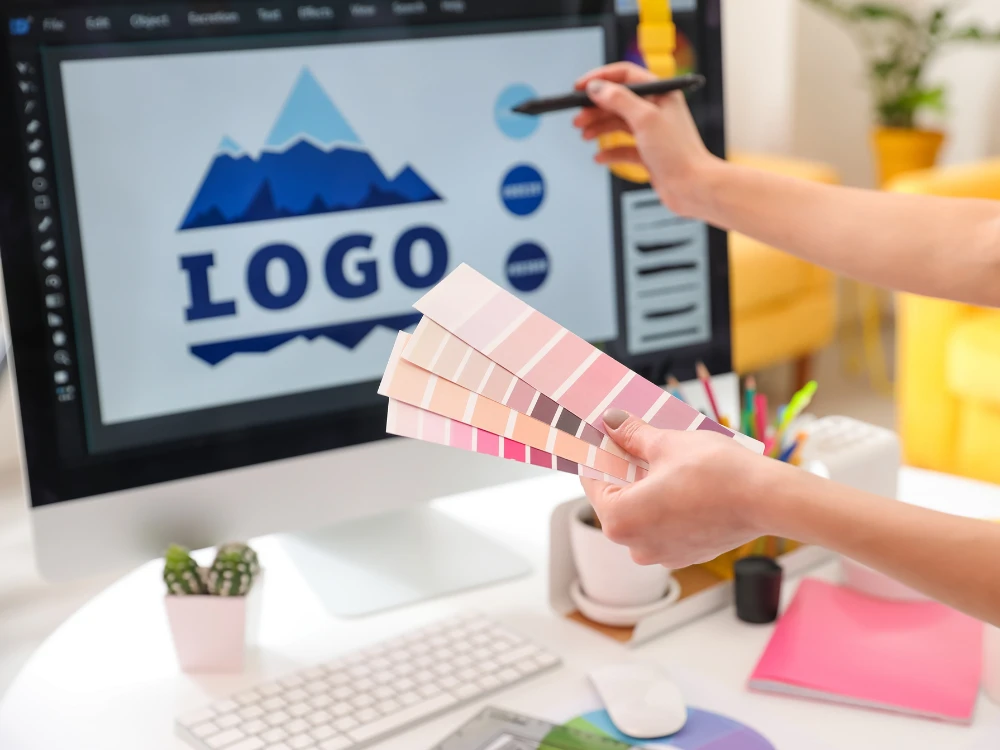
WebSnarks starts a logo design service project with a short intake call, not a mood board template. We ask what you actually sell, who buys it, and which competitor’s logo you secretly can’t stand — that last one tells us more than most style questionnaires do. From there, our designers sketch multiple directions before anything touches a computer, because a logo that only looks good in Illustrator often falls apart the moment it’s stitched onto a hat or shrunk into a favicon.
A brand-new business gets a clean-slate concept process — no legacy shape to work around, full freedom on direction. A logo redesign for an existing business is a different job entirely: we’re usually keeping some recognizable element — a color, a symbol, the general feel — while fixing what’s actually not working (a mark that doesn’t scale down, colors that print inconsistently, a font nobody can read on mobile). Tell us upfront which situation you’re in; it changes how the first concepts get built.
A logo delivered as a single JPG is a logo you’ll have to pay someone to fix the first time a print shop asks for a vector file. We deliver layered source files (AI or EPS) for anyone who needs to edit or scale the mark later, plus flattened PNG with a transparent background for web use, a JPG for anywhere transparency isn’t supported, and an SVG for crisp scaling on modern websites without any quality loss. Skipping the source file to save time upfront almost always costs more later, once a sign shop or a merch printer asks for something we already had ready to go.
The concepts that get scrapped and restarted usually share one root cause: too many people weighing in before a single direction gets picked. A founder, a business partner, and a marketing hire all giving separate feedback on the same three concepts often pulls the design in three incompatible directions at once. The projects that move fastest have one clear decision-maker on the client side — everyone else can react to the chosen direction once it’s picked, rather than voting on every early sketch.
“ The logos created by WebSnarks are extremely unique. Each logo displays perfection and originality that impresses. Good Work. ”
“ WebSnarks creative approach to logo design really stands out to me. Their logo designers differentiate themselves through their outstanding customer service and focus on detail. ”
“ I love the creative logos designed by WebSnarks. They created exactly what I wanted and the process was super easy. Highly recommended! ”
“ The logo designs created by WebSnarks showed my brand's nature. They have taken my vision and turned it into images that have a real resonance. They made a huge difference throughout the process with their help and expertise. ”
Plenty of businesses come to us with a color that’s already stuck — maybe it’s on an existing storefront sign, printed packaging, or years of Instagram posts — and a full color change isn’t realistic even if the original choice wasn’t great. We treat that as a real constraint, not an obstacle to argue around. A logo can usually be significantly improved in shape, weight, and clarity while keeping the core color intact, which matters more to recognition than most people expect going in.
That depends on the scope of your specific project — share your business details through the contact form and we'll walk you through what's included before any work starts.
A logo is one visual mark. If you need the color system, typography, and voice that goes around it, that's covered under our branding services instead — the logo is one piece of that larger system.
Yes, a simplified icon-only version is typically part of a logo project, and if you need a full custom icon set beyond that, check our icon designing service.
No — WebSnarks works exclusively with businesses based in the United States. That focus means every project is built around American sizing standards, U.S. print vendor specs, and how a US audience actually responds to a mark, instead of a generic approach built for a global market.